Multi-State Checkboxes
Some flavors of markdown support task lists but I wish they supported more than checked and unchecked states. In reality, tasks have many more states, and we usually keep a status field to track things like in progress or blocked.
I’m experimenting with my own expanded markdown syntax for tasks which supercharges the checkbox to reflect the most common states I use across my work. After a few iterations, this is the current syntax I use:
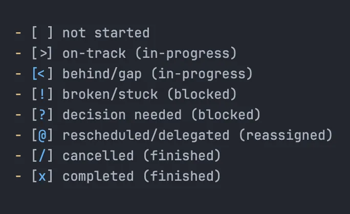
<!-- Markdown syntax for multi state checkboxes -->
- [ ] not started
- [>] on-track (in-progress)
- [<] behind/gap (in-progress)
- [!] broken/stuck (blocked)
- [?] decision needed (blocked)
- [@] rescheduled/delegated (reassigned)
- [/] cancelled (finished)
- [x] completed (finished)
My criteria
I love small quality of life wins like this but only if they don’t create more problems than they solve. Sometimes these things create more cognitive overhead than they remove. Sometimes they break other software. Sometimes they break when other software updates.
When these are small productivity or aesthetic wins, there’s a pretty low threshold for the trouble they are allowed to cause before they’re just not worth the trouble and I’ll rip them out someday and question what my prior self thought complicating my setup this way.
In short, I wanted something that will render reliably and beautifully - primarily in Obsidian, but also degrade gracefully when viewed in github, or raw .md files - and be a net gain in my day to day work.
So up front, I wrote down the things I wanted to achieve and tradeoffs I’d accept:
- be fast to type
- be easy to remember the meaning (when reading and writing)
- be easy for LLMs to adopt and use
- work well in Obsidian, without enabling community plugins
- work well in any text editor (raw markdown UX)
- degrade gracefully but remain functional on github.com[^1]
- don’t require lot of code or dependencies I need to fix/maintain
So how are we doing?
✅ Be fast to type
Yep, just plain text using common keyboard characters.
Visually I really wanted completed to be [✓] but entering that symbol was going to be too much work, and it was going to break compatibility with most markdown tools which expect [x] to mean “checked”.
✅ Be easy to remember
I chose symbols that work for me. These may iterate over time as I see what I need, and if I ever get confused or struggle to remember one. So far no issues.
✅ Be easy for LLMs to adopt and use
Yep, again plain text, nothing fancy. I have a markdown file that explains the syntax LLMs can look up if needed. Haven’t had any issues yet.
✅ Work well in Obsidian, without enabling community plugins
I’m really happy with how this part turned out. I run Obsidian without plugins - this keeps code complexity low and avoids a host of security concerns with enabling 3P code to run in Obsidian and on my computer. The downside of that means I’m extremely limited in how I could set this up (a bit of javascript could enable so much nice interactivity here).
Obsidian does make this easier bc it parses the symbols inside the square brackets and passes those to a data-task attribute in the rendered html with the checkbox. So in Obsidian, using just CSS, I can hide the default checkboxes and render a nice aesthetic
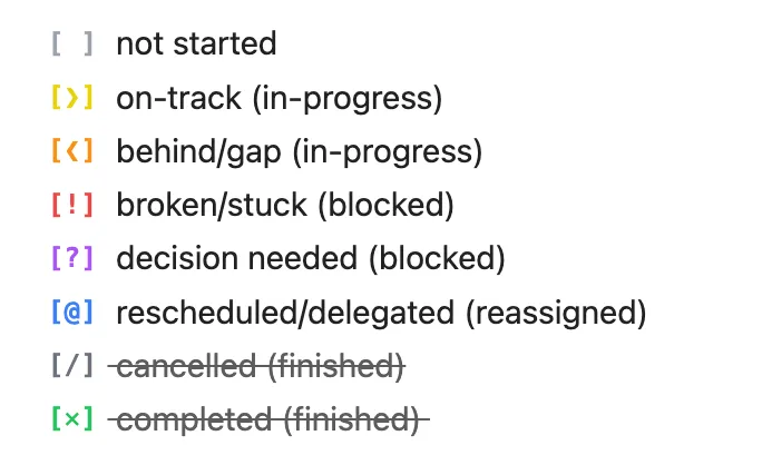
✅ Work well in any text editor (raw markdown UX)
Yep:
🤔 Degrade gracefully but remain functional on github.com
This is where I knew I’d need to accept some tradeoffs, and it’s definitely not great. I’d love this to be neater. But short of getting github flavored markdown spec updated to support multi-state checkboxes (maybe some day?!), and given this is mostly for my own internal task management, I’m just accepting this tradeoff for now.
When viewing a markdown file on Github:
When inside a code fence:
✅ Don’t require lot of code or dependencies I need to fix/maintain
Yes! It’s just plain text. There’s no custom javascript or plugins since I had the “no Obsidian plugins” requirement from the start.
There’s just a custom CSS snippet in Obsidian to improve the appearance in both view and edit modes, which you can find here.
Alternatives that didn’t make the cut
I started at something close to plain text, then explored fancier directions for a while before coming back to the simpler text only version in the end.
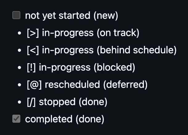
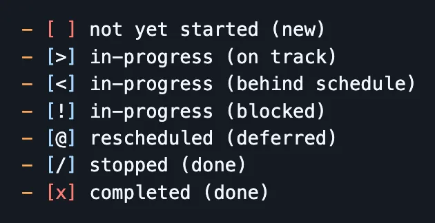
Checkboxes inside codeblocks
This was a fix for better aesthetic on Github because the checkboxes are monospaced, but it’s a lot of extra typing and breaks the default html checkboxes.
[ ]not yet started (new)[>]in-progress (on track)[<]in-progress (behind schedule)[!]in-progress (blocked)[@]rescheduled (deferred)[/]stopped (done)[x]completed (done)
Generate images on the fly
I used shields to prototype this quickly though I figured I’d make my own endpoint for outputting a good aesthetic with minimal input 
This was an interesting idea but requiring a network request and running a server was a huge complexity/cost that doesn’t achieve the goals
not yet started (new)
in-progress (on track)
in-progress (behind schedule)
in-progress (blocked)
rescheduled (deferred)
done-stopped
done-complete
Emojis
This was my iteration on the generated images idea but without the network request to a server. This just felt too cliche, is already used a lot in headings, is too hard to type quickly, and seems too arbitrary what icons should be used.
- 🗒️ not yet started (new)
- ⚡️ in-progress (on track)
- ⏰ in-progress (behind schedule)
- ✋ in-progress (blocked)
- 📆 rescheduled (deferred)
- ❌ stopped (done)
- ✅ completed (done)
Others
I can see some more potential options where I use base64 dataURIs or svgs to do the above image variants but without a network request, and probably just within a .css file.
But I parked the exploration here and focused on a text based version that would work most consistently across my main surfaces. After using it for a few weeks/months, I’ll learn more if I need to venture into this complexity for any reason. So far I don’t see a reason.